Proposal Design 101: A Beginner’s Guide to Professional Proposals

“What if our proposals don’t look professional?” is a fear of many small business owners who are competing against larger companies. The truth is, it doesn’t require advanced design knowledge to make your proposals professional enough to stand out from the competition. In this blog post, we cover a few beginner proposal design best practices that you can apply to your proposals today.
Know Design Basics
The first step in proposal design is to have an understanding of basic design principles. There are three main categories that are critical to strong proposal design: color, text, and headings.
Color
Done well, color can enhance your proposal by highlighting key information, showcasing your brand, and make the document overall more interesting. It can be easy to overdo it, though. Make sure you always have plenty of whitespace throughout your document, which means sections of the page where there are no text or visual elements. This gives the reader’s eyes a break when viewing your document and helps it to not be too cluttered.
To get started with adding color to your proposal, choose up to three colors:
One color for body text, typically a black or dark gray.
One primary color. This is typically a part of your logo and key branding color for your company.
One secondary color. This will be used less frequently and is perfect for callouts, bolded text, or other aspects where you want to draw attention.
Make sure you choose colors that are part of your brand. If you only have a logo and don’t know your brand colors, you can upload an image at coolors.co and find out the colors.
Text
Proposals have a lot of text, and this makes it critical that your text design is easy-to-read. For your body text (i.e. the main text of the document), choose a style that isn’t too small or large for use in multiple pages of text. As a rule of thumb, follow this style recommendation:
Font Size: Keep font size of body text between 10-12 point font.
Style: Arial or Times New Roman are both easy to read when printed or on a computer. If you respond to RFPs, one of these may be required.
For Arial, use a size 10 or 11. For Times New Roman, go with 11 or 12.
If you aren’t a designer, stick with one of these two styles to ensure that your proposal is easy to read and you won’t encounter any issues when saving your file as a PDF.
Note: If you use Arial Narrow, sometimes this will change depending on how you save the final PDF file (if you’re using Microsoft Word). If in doubt, just stick with regular Arial.
Headings
Headings are the perfect way to split up long sections of text within your proposal and also to signal a change of topic. At a minimum, have three different types of headings (Headings 1-3) to use throughout your proposal.
Heading 1 will be used as your section headings, such as Pricing, Scope of Work, Company Overview, or Project Team. This is what will go in your Table of Contents.
Headings 2-3 will be used to split up sections within each of those sections. For example, your Project Team section might have a “Team Overview” and then “Resumes” contained within that one section. You will use these headings to make it easy to navigate.
You can incorporate color into your headings, but make sure it is easy to read. For example, yellow can sometimes be difficult to see on certain screens if it’s too light or too small.
Keep your headings in the same font family as your body text, and make it bigger, bolded, or a different color to add contrast. Size 14-24 point font is a good starting point. Play around with the sizes and styles until it looks right to you.
Choose Your Tool
Now that you know the basics of proposal design, it’s time to choose the tool you will use to design your proposals. There are many options to choose from, and we go into the pros and cons of each below.
Adobe InDesign
Pros: Adobe products are the Gold Standard for any type of design, and by using this tool, you are guaranteed to have all of the features you need.
Cons: Licenses can be expensive, and it can have a steep learning curve if you don’t already know how to use the tool. Text must also be final before you can design it because this is a design tool, not a word processor.
Microsoft Word
Pros: You can design as you create content in Word. Because it is a Word processor, you can add your styles and still revise content. Most people have a Microsoft Word license and are familiar with the tool, which means no added cost.
Cons: Word isn’t a design tool, which means you are limited in the complexity of any graphics you can create within the document. Instead, you have to design the graphic elsewhere and then paste it into the document, which can increase the file size.
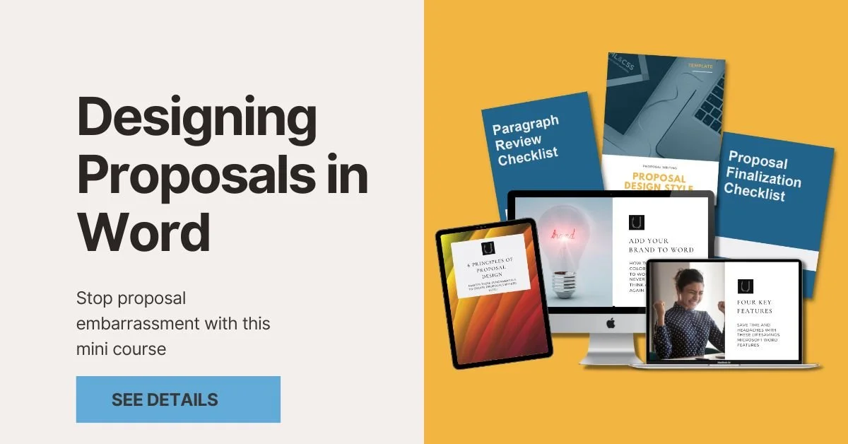
Watch the video below to get started designing in Word:
Canva
Pros: Canva is free to use and great for proposal design. It even includes free proposal templates that you can choose from.
Cons: You have to pay for some advanced features. Similar to InDesign, content must be final before you start designing it.
These are the top three ways to design your proposals, but if you use a proposal software, most of these will allow you to design within the platform. If you aren’t sure what’s best for you, try them all out and choose the best fit.
Callout Key Points
When you decide your proposal design tool, the first step is to build-in your design styles, such as the body text, headings, and the cover page. If you’re including a cover letter, add in your company letterhead as well (or use Canva for inspiration if you don’t have one!).
With the basic design done, the next step is to callout key points throughout your proposal. This might be in the form of adding bullet points to split up long paragraphs or bolding key text within your content. You might also want to include callouts that display a key point larger than your text. For example, if you have completed 200+ projects in the area that you are bidding, create that metric as a callout. Anything that is a key differentiator for your company should be highlighted so the reader doesn’t miss it.
Create Graphics
More advanced graphics are another way to make your proposals more professional. Areas where you might create graphics include descriptions of processes, timelines, organizational charts, or any other topic that is complex to explain over text. For these complex graphics, you will need to use either Adobe or Canva because often they are too complicated to do in Word (though the SmartArt or designing in PowerPoint may be possible).
If you aren’t sure how to visualize these topics, Canva does have some easy-to-customize templates. For graphics that will be reused in many proposals, it may be worth it to work with a professional designer to create something professional that will stand up over time.
Add Personality
With all of the basics of design out of the way, the last step is to have fun with your proposal. You can add personality to your proposal to build trust and show that you are a real company with real people who can help solve the customer’s challenge. Ways you can do this include adding headshots on resumes or bios, sharing team photos, including product photos, and more.
By following the tips laid out here, you will create a creative and engaging proposal that customers want to read. Now you no longer have to worry about if your proposal is professional or not!